This piece is a continuation of two previous posts on Racial Data and Inequity. If you haven’t read those pieces, I would encourage you to do so as I refer back to them at several points in this piece. Those pieces were uncomfortable for me to write (as a white male) and this one probably doubly so as I am (admitting it here) largely ignorant on Indigenous history. That being said, I will begin with this:
I write this post on the traditional territory of the Three Fires Confederacy of First Nations, which includes the Ojibwa, the Odawa, and the Potawatomie. We respect the longstanding relationships with First Nations people in this place in the 100-mile Windsor-Essex peninsula and the straits – les détroits – of Detroit.
Gaps in Data
Following the pieces on race coming out, I was asked about Indigenous populations, where are they in those numbers. Unfortunately the answer is complicated. According to the Statistics Canada: “The Employment Equity Act defines visible minorities as ‘persons, other than Aboriginal peoples, who are non-Caucasian in race or non-white in colour.” [underline added by me]
This definition then frames the categories that are included in Census and all of the data in the previous two posts. Officially, Aboriginal or Indigenous peoples are captured in question 18 of the Census with a yes or no self-identification question with follow up sub-questions on specific identifies and registered status etc. If you answer yes to question 18, you are not required to answer question 19 which is the visible minority question.
In the context of visible minorities, Indigenous population are included in the total of non-visible minority populations. In other words, it lumps white people and indigenous people into category outside of the other twelve visible minority populations. [Note this does mean that the labeling on the correlations in the Racial Inequality Piece for “White People” was not truly accurate. I have updated that chart and made a note in the post].
This also creates challenges for certain sub-populations for example person who identifies as being both Black and Indigenous would appear in the Indigenous population capture and in the multiple identities categories in the racial data assuming they completed that question. This means there is no easy way to add together visible minority and indigenous data as can’t just add the two datasets together to get a total population of BIPOC for our region as there is likely some double counting between the Indigenous and visible minority populations.
Beyond our local data, Statistics Canada does do a full reference guide on aboriginal populations as Census data of Indigenous population who do have higher rates of non-response (particularly on reserve) of the census. Locally many of the data gaps that were outlined in the post of Racial Data post hold true for Indigenous populations. Cross-tabulations from Statistics Canada for Indigenous specific data is not publicly available at a sub-municipal level. Many of the same blind spots within institutional data exist for Indigenous populations in our region with regards to public data. Now there is little doubt, in my mind, that organizations (particularly government) are tracking more data related to Indigenous populations as gathering information on status or identify has been more widely administered (in some cases mandated) than racial data. The issue is, that it is not public.
I was unable to find significant targeted research on indigenous populations locally. One piece of data that is available is from the Point in time Count from 2018 which found that 22% of the respondents experience homelessness identified as Indigenous in our region. The Health Unit within some of their report do include indigenous populations when engaged or data was accessed in the context of broader community public health research.
Digging into the Data
One of the defining features of Essex County is that it does not have a reserve in it (a good map of Ontario here). Reserves are problematic in numerous ways with large volumes of research and articles on their impacts (here, here, here or here are a few samples that I googled in 2 minutes) . From a purely data standpoint reserves allow clearly delineate and identify populations, issues and inequalities more easily.
Within the Census data Indigenous populations are predominantly defined by two categories with numerous sub-groups: self-identified Indigenous populations and official status populations. As Essex County does not have a reserves in our region, these populations are far more disbursed across our region when compared to Lambton County which is home to Walpole Island and Aamjiwnaang Territories. In those cases, specific census dissemination areas capture data on those territories allowing for comparisons between on reserve and off reserve Indigenous populations as well as the wider region.
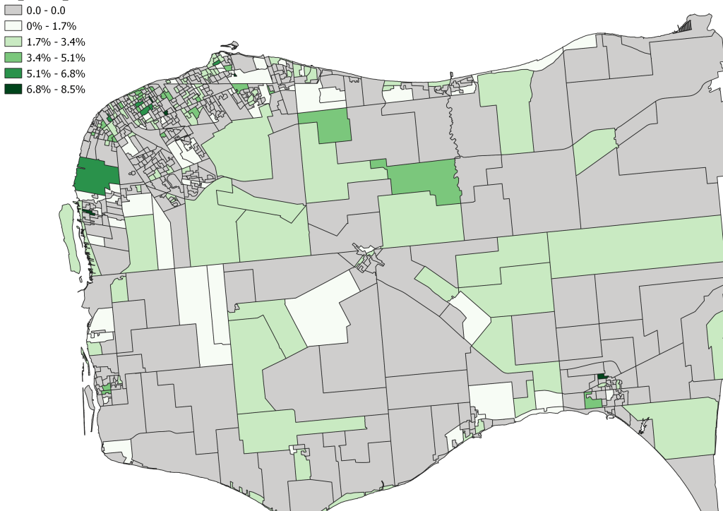
Overall there are approximately 9,800 individuals who identify as Indigenous in Essex County representing about 2.51% of the population. In the context of other visible minorities this would be the 4th large non-white group in Essex County (behind Arabs, South Asians and Black populations respectively). The official treaty status population is naturally smaller subset population with only about 2,300 individuals representing less than one percent of the overall population (0.65%). Broken down by community and City ward it looks like this:
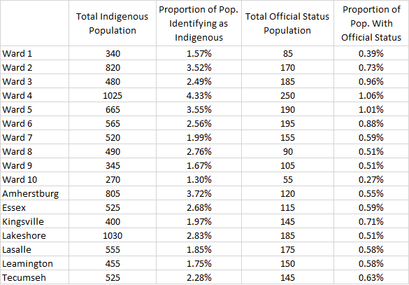
Despite being about the 4th largest population in Essex County Indigenous populations seem to be more disbursed across the region. Arabs for example make up almost 7.6% of Windsor population and over 16% of the population in Ward 10. It is somewhat surprising the Lakeshore seems to be home to most more self-identified Indigenous People closely followed by Ward 4 in Windsor. Given the socio-economic make up of these communities (particularly the high concentration areas in Ward 4) these generally speaking are not low-income communities which people would generally equate to indigenous populations. When we map this data, here is what we find:
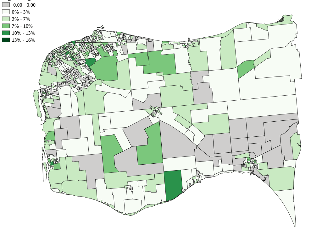
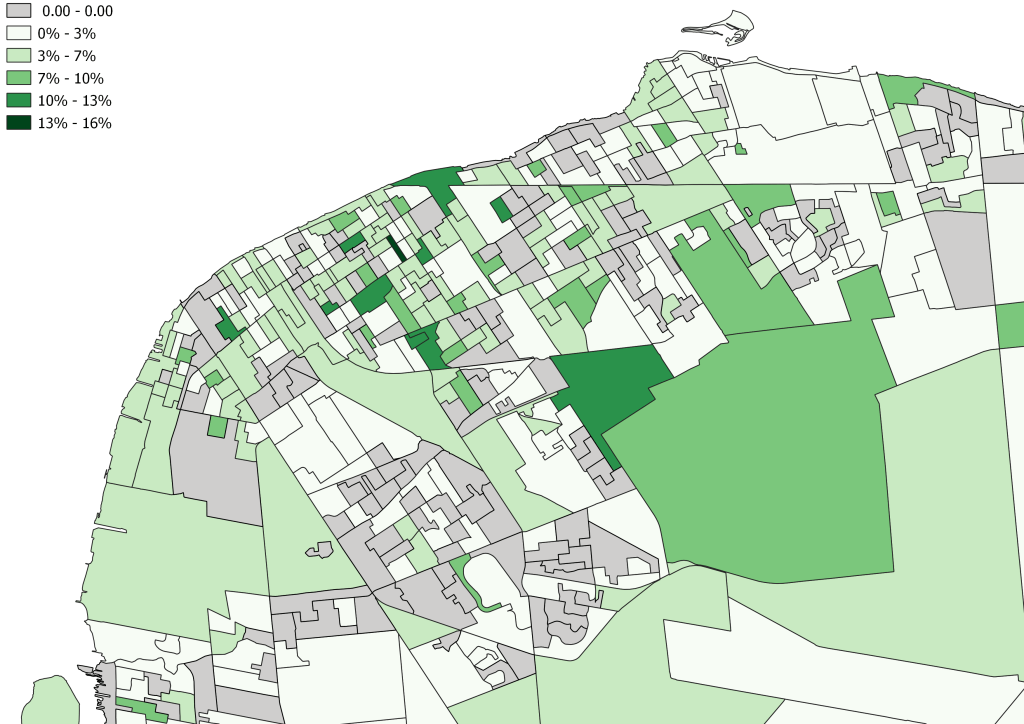
When looking at these maps, the same warnings about certain DA having larger or in this case smaller total populations skewing data the visuals apply. This skew is still found in total population counts:
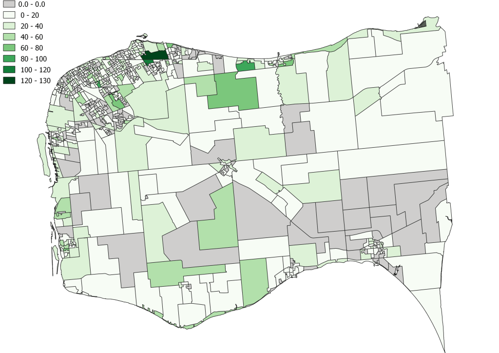
When looking at the total population you can see the East Windsor DAs that are over sized over represented, large total Indigenous populations while some of the high percentage neighbourhoods have relatively lower totals indicating that those DAs may have few total people in them. Remember that DA generally have between 500-700 people but some (particularly in rural areas) do have smaller populations in some cases just do to being a remainder area when the DA were designed or areas where population just saw a decline and adjustments hadn’t been made. In looking at the mapping a clear difference between the visible minority data is that there are larger pockets of the City where no individuals identified as Indigenous.
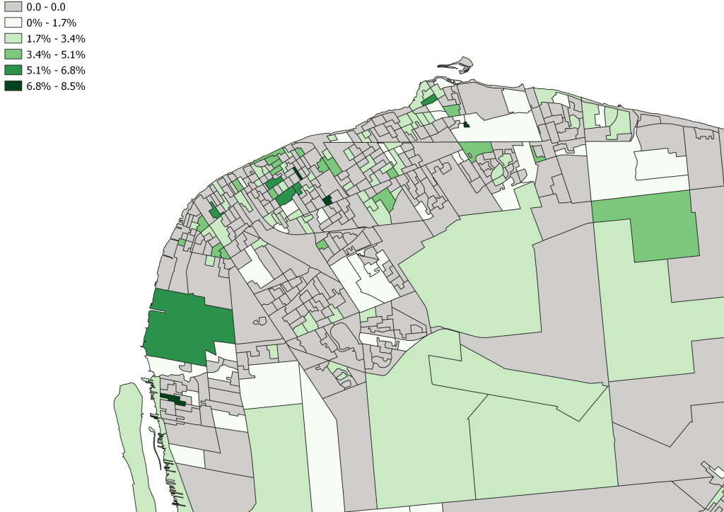
The mapping for the “status” populations mirrors the above mapping with the percentages shrinking and a the number of zero responses climbs:
Of course Indigenous populations are not monoliths and when we breakdown Indigenous populations between First Nations, Metis, Inuk (Inuit), Multiple and other responses we find:
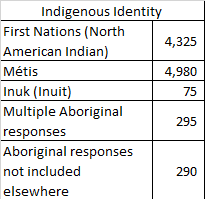
I did create maps for these populations and but it did not show explicate clustering and given the small population totals, in many cases, DA are home to a handful of households resulting in skewed visualizations.
Correlations
As with the visible minority populations, these correlations are an imprecise way to look at relationships between statistical factors. They do not explicitly state that the relationship exists but they certainly point towards some method of connection. Correlations were not run for Inuk, Multiple or Aboriginal Responses not included elsewhere due to the small sample sizes which when spread out over the region’s data resulted in what I deem skewed results.

Based on these results, locally in Essex County, Indigenous populations seem to be doing better than certain visible minority populations according to the size and strength of the correlations that have been found. Encouragingly the significant correlations that were found are in high school and post-secondary completion. While negative outcomes like low income, lower median and average wages and poor housing quality do have some positive relationship, but not at a level of significance that was found in Black and other visible minority populations.
The fact that Registered Status populations shows a weaker relationship with many of the correlations is interesting. The are less likely to have a post-secondary degree compared to the total indigenous population but curiously Low income and the negative median and average income relationships are both weaker with this population.
When compared to non-indigenous populations the point that jumps out is the top income decile holding a very strong correlation at 0.637. While non high school completion and housing unsuitability also feature significant correlations in the data. Obviously non-indigenous populations is an amalgamation of both white and the other visible minority categorizations who are not indigenous so some of the strongest scores from both of those groups are pushing through the averages.
Looking beyond the correlations and digging into data like Community Housing building locations and Indigenous populations in the same Census DA, you do not see the same relationships that were apparent in some of the visible minority data. That isn’t to say that Indigenous individuals or families aren’t living in those buildings, but they do not appear to be in the concentrations that Black or Arab populations are.
Conclusion
In my opinion the data on Indigenous populations in Essex County seems to be far more complex than it seems. As I stated when started exploring the racial data, this data is not telling the broader story of individuals or communities. It is a snapshot in time, for a population at the point in history. Based on this data are Indigenous peoples doing as well as white people, no they aren’t, but no visible minority group is.
That being said, Indigenous populations do seem to be doing better than some visible minority groups when looked at in aggregate. The geographic spread of the population is certainly interesting as well as the impacts of clustering populations and community/cultural ties would be something that could be further explored. The fact that statistically that Indigenous populations seem to be doing well socio-economically in our region is encouraging but not a universal truth.
What this data doesn’t show is that Indigenous peoples are not facing systemic racial barriers to success or are represented properly in our community. Just doing okay doesn’t make up for the historical injustices that they have faced. So like with engaging visible minorities, there is work that needs to be done here as well.

Pingback: A Few Thoughts on Week 16 | gingerpolitics
Pingback: A Few Thoughts on Week 23 | gingerpolitics
Pingback: A Few Thoughts on Week 48 | gingerpolitics
Pingback: A Few Thoughts on Week 67 | gingerpolitics