On Monday the Maclean’s released their Charts to watch in 2021. With dozens of charts from leading economists I figured I would pick 10 that I think have impacts or implications on Windsor-Essex.
Stronger employment growth needed
Brendon Bernard, economist, Indeed Canada (@BrendonBernard_)

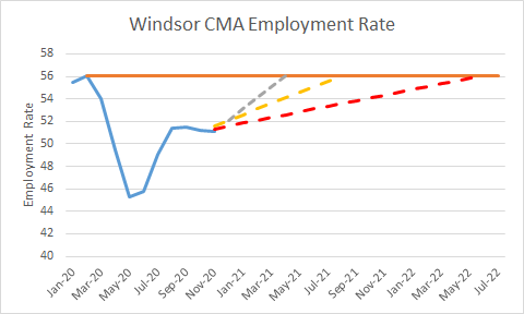
What the chart above looks at is the number of jobs that has to be added to bring employment by to pre-pandemic levels. In Windsor the chart looks like this.
There are approximately 13,000 jobs missing from the local labour markets based on the employment rate and active labour force. Now a big chunk of this has been over 11,000 people dropping out of the labour force. Between Jan 2016 and Dec 2019, which was largely considered a good economic period for our region, the employment rate growth on a monthly basis was only 0.00014% or 188 new jobs full time equivalents every month. Using that pace, it will take 69 months to return to pre-pandemic employment levels assuming the labour force doesn’t rebound. Fortunately for us some, of this is a shock that will return rapidly when restrictions are lifted, but the 2000 job gap between the labour force and employment rate based on pre-pandemic calcalations. Based on the traditional growth rate it will take 10 months to recover assuming pre-recession growth rates (yellow line dotted line on the chart above). The Grey and Red lines show double growth rate and half rate based on those values. As always local labour force numbers have a standard error of +/- 5.5%.
To sum up- Windsor is going to face a long and potentially difficult recovery.
Measuring the she-cession in Canada
Armine Yalnizyan, economist, Atkinson Fellow on the Future of Workers (@ArmineYalnizyan)

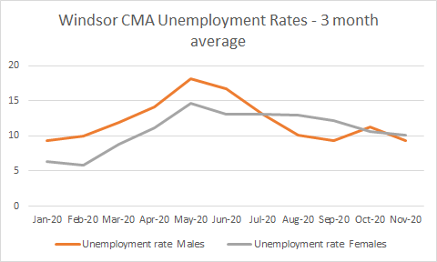
Fact: Women have been disproportionately impacted by the pandemic in Windsor CMA and here are the charts to prove it.
Although the three month averages do “flatten the curves” you do see two unique elements. Initially our region is a bit unique as women have always lagged in labour force participation. The result was a lower unemployment rate for women as they were not looking for work to be counted. In the lead up to the pandemic there were some season impacts like construction tending to be slower in Winter that also tend to disproportionately impact men. That being said by summer, when manufacturing and construction were back and the averages had time to shift through the curve, women led and continue to lead in unemployment.
When you control for historic “not in labour force” data the local “she session” becomes clear. An additional 7,000 females were out of the workforce compared to Jan 2020 in Nov 2020. This is structural to our economy as restaurants, arts and culture organizations, tourism etc. do employ more women in our region than other sectors. Women are more likely to be able to work from home but you still have childcare, online learning and other ongoing socio-economic issues that are leading to individuals becoming disconnected from the workforce.
Canada’s debt load will weigh down the loonie

David Wolf, portfolio manager, Fidelity Investments
I am by no means an expert in monetary policy but thinking about local implications of a cheap loonie. Oil which has always also been a driver of the loonie isn’t likely to bounce back much either so odds that the exchange rates closes with the US are likely slim.
Obviously it is bad for cross border shoppers and trips to Detroit (when we can do that again) but there are a few groups that might benefits. Manufacturing for example becomes more competitive vs US sites while a cheap dollar could also be something to attract on-shoring US (specifically Detroit) tech or other operations into our community.
One big spot where this price may hurt taxpayers is in the Gordie Howe Bridge construction which is being paid for in Canadian dollars and a depressed currency could negatively impact up to 50% of the construction cost, as well as short change the Delray community on their Community Benefit package, which is calculated from a CDN$ value.
Our punishingly complex income and social supports system
Lindsay Tedds, associate professor of public policy and Gillian Petit, PhD candidate, department of economics, University of Calgary (@LindsayTedds and @GillianPetit)

The chart above illustrates the programs and services that make up the social service system in BC. The Government of Canada wedge is exactly the same for Ontario more or less. In Ontario, things like housing and homelessness and seniors bus passes have been downloaded or always were the responsibility of the municipalities. This wheel also doesn’t show of the fragmentation that can occur at the service access level. Actual delivery of some of these programs are then offered through non-profits, charities or municipal governments/institutions.
Frankly this wheel is overwhelming and I work in the social service sector, but I don’t think it is a reason for UBI as some of you will argue.
Better off at the top than the bottom
David Macdonald, senior economist, the Canadian Centre for Policy Alternatives (@DavidMacCdn)

Although no local data is publicly available, Windsor is home to one of the lowest living wage rates in the Province while our region has seen incomes decline. At the time of the Census we had one of the highest low income rates in Canada. All signs point towards that Windsor is in fact in many ways a low income jurisdiction in our region. In fact based on 2018 Taxflier data on Wages, Salaries and Commissions: the Windsor CMA has one of the lowest 25th percentage wages in Ontario and second lowest median wage.
COVID-19 wreaked havoc on household spending on transport
Anna Feng, economist, Conference Board of Canada

There are some big questions here. A long slow recovery for transit could put pressure on local transit system expansions and redesigns that were in the works. It is likely that Windsor airport will see fewer flights and higher prices attached to them. VIA Rail could be see financial pressures as an end of the line stop do few trains leave/end in Windsor? Even car repairs declining is certainly a sign of less usage due to lockdown. As I wrote about previously as our region is very car dependent whether trend rebounds as the economy goes back to normal or if cycling and other modes of transport replace it remains to be seen.
Manufacturing investment to lag without government action
Alan Arcand, chief economist, Canadian Manufacturers and Exporters (@AlanArcand)

To be clear Canadian Manufacturers and Exporters is a lobby group for their respective sectors. So a graph showing lagging investment followed by a description calling on additional government support isn’t exactly a surprise. It is also interesting as due to the time scale, this chart would include the UAW auto deals in 2019 for the US but not include the UNIFOR deals in 2020 so the gap may close when updated.
Credit to Japanese automakers where its due
Brendan Sweeney, managing director, Trillium Network for Advanced Manufacturing (@B_A_Sweeney)

As a auto town, we like to think that we are the heart of the auto manufacturing sector with what remains of the Big 3 footprint in our community. What the above chart shows is the slow decline in market share of the Big 3 over the last decade in Canada and the gradual rise of Japanese automakers based in Woodstock, Cambridge and North of Toronto. Although the investments of the 2020 auto talks could spur new products and sales, but if people don’t want to buy mini-vans anymore we could have a problem.
A precarious outlook for Toronto’s condo market
Ben Rabidoux, president of North Cove Advisors Inc. (@BenRabidoux)

The collapse of the Toronto Condo Market would be bad, let be clear. It has the potential of derailing the development renaissance occurring in downtown Windsor. The over inflated condo market in Toronto was already showing weakness pre-covid. The size of the market has the ability to disrupt the entire housing market in Toronto and compound any broader economic downturn.
The question that has to be answered from a Windsor perspective is who is going to live (or own) all of these units that are emerging downtown? Assuming that GTA investment plays a significant role in the housing market here, I would argue there is evidence that it does, a collapse in equity in the GTA will hurt development plans in Windsor and other part of Essex County.
If you build it, they will electrify?
Sara Hastings-Simon, senior researcher, Colorado School of Mines; Research Fellow, University of Calgary (@S_Hastingssimon)

Windsor is likely going to build electric vehicles after 2023 but as the chart above illustrates the choices for these vehicles are actually very limited in Canada. The question really becomes will Windsorites and Canadians more broadly buy them?


Pingback: A Few Thoughts on Week 39 | gingerpolitics